
Wall Decor Ideas for Living Rooms: Complete Guide (2026)
You know that feeling when you walk into someone’s living room and it just looks right? Everything feels considered, the walls actually say something, and you can’t quite put your finger on why it works so well. Then you come home, stare at your own walls, and wonder where to even begin.
If that sounds familiar, you’re in good company. Most people find wall decor weirdly tricky. It’s not that they have bad taste. It’s that nobody really teaches the basics. So you end up buying something, hanging it, stepping back, and thinking, “that’s not quite it” without knowing why.
This guide is here to fix that. Whether you’re decorating your first apartment or giving a tired room a much-needed refresh, you’ll walk away with practical ideas you can actually use. No design degree required, no huge budget needed. Just straightforward advice that makes a real difference.
Quick Summary
WHO THIS IS FOR
Home decor beginners and anyone wanting to freshen up their living
TIME TO READ
13 min
TOP 3 TAKAWAYS
1. The Less-Is-More Philosophy
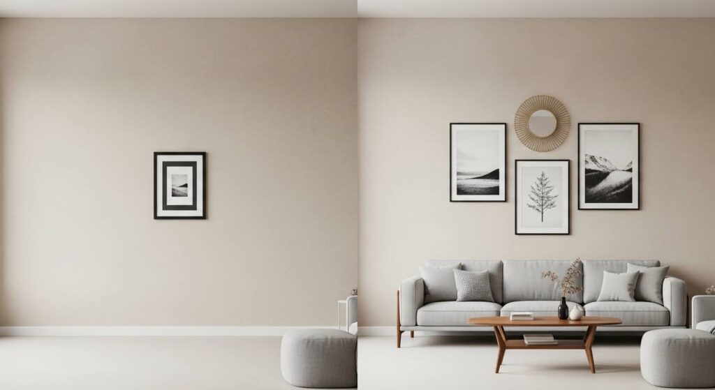
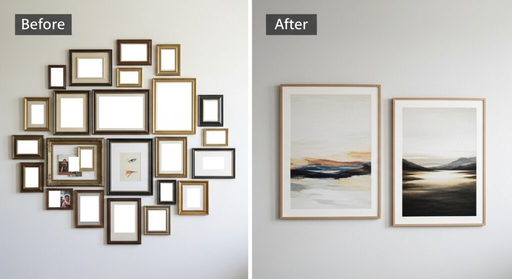
There’s a strong temptation, especially when you’re starting out, to fill every inch of wall space. It feels productive. It feels like you’re doing something. But more often than not, it just ends up looking cluttered, and the individual pieces stop mattering.
Think about it like editing a piece of writing. The words you cut are just as important as the ones you keep. On a wall, the empty space around an artwork is doing real work. It gives your eye somewhere to rest and makes the piece itself feel more intentional.
The most powerful thing you can do right now? Pick one wall and put up one good piece. Just one. Live with it for a few days before deciding whether to add anything else. You might be surprised how often the answer is that you don’t need to.
A few things to keep in mind:
- Stand across the room and squint at the wall. If it looks busy, it almost certainly is.
- Choose a standout piece first and let everything else support it, rather than collecting items at random.
- White space, breathing room, empty wall area — whatever you call it, it’s a design choice, not a gap waiting to be filled.
2. Choosing a Focal Point
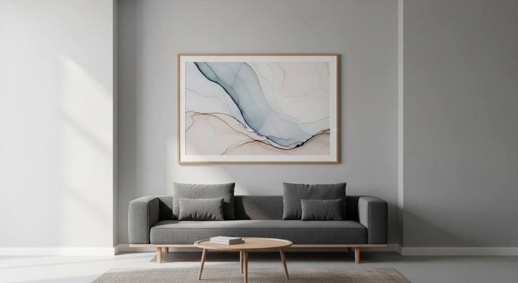
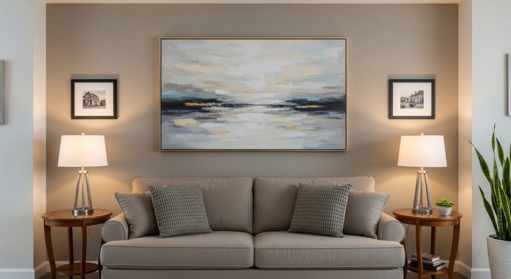
Every living room has one wall that naturally pulls your attention when you walk in. That’s your focal wall. In most rooms, it’s the wall your sofa faces, the one behind it, or wherever there’s an architectural feature like a fireplace or a bay window.
If you already have something architectural to work with, lean into it. A strong piece of living room wall art centered above a fireplace, or a large mirror hung between two windows, works beautifully because it’s working with the room’s existing structure rather than fighting it.
No standout architectural feature? That’s fine too. You can create a focal point from scratch with a single bold canvas, an accent wall in a deeper color, or even a thoughtful arrangement of shelves and objects. The goal is simply to give the room one clear visual anchor everything else can relate to.
How to find your focal wall:
- Step through the doorway and notice where your eyes land first. That’s your focal wall.
- Put your strongest, most interesting piece there and let the surrounding walls stay quieter.
- If you’re unsure, the wall behind the sofa is almost always a safe, reliable choice.
3. Scale and Proportion Basics
Here’s the thing about scale: it matters more than almost any other factor, and it’s where most people get it wrong. A beautiful print hung above a sofa can look completely lost if it’s too small for the space, and an oversized piece crammed into a narrow corner just feels uncomfortable.
A reliable rule of thumb is that your wall art, or the grouping of pieces you’re treating as one unit, should span roughly two-thirds of the width of the furniture beneath it. So if your sofa runs about 84 inches wide, you’re looking at art or an arrangement somewhere in the 55 to 63 inch range.
For anyone working in a smaller apartment, this doesn’t mean spending big on a single large canvas. Grouping several smaller pieces tightly together gives you the same visual weight as one large piece, often for a fraction of the cost. The effect is the same; the room feels considered and complete.
Quick scale guide:
- Compact sofa (under 72 inches): one medium piece, or a two to three piece grouping arranged close together
- Large sectional: go big — a wide triptych, a generous canvas, or a full gallery wall across the length of the sofa
- Narrow walls: arrange pieces vertically to make the room feel taller
- Low ceilings: hang art a little higher than usual to draw the eye upward
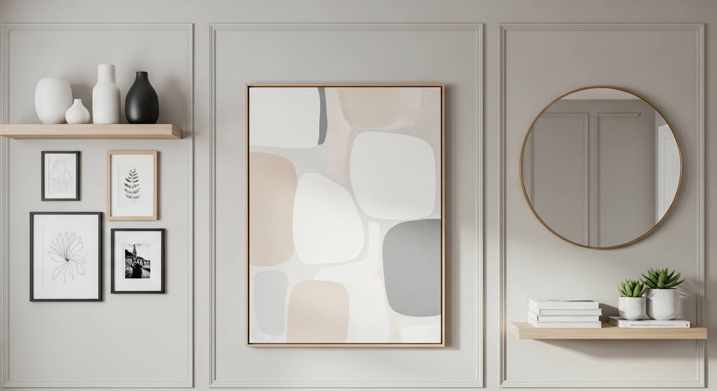
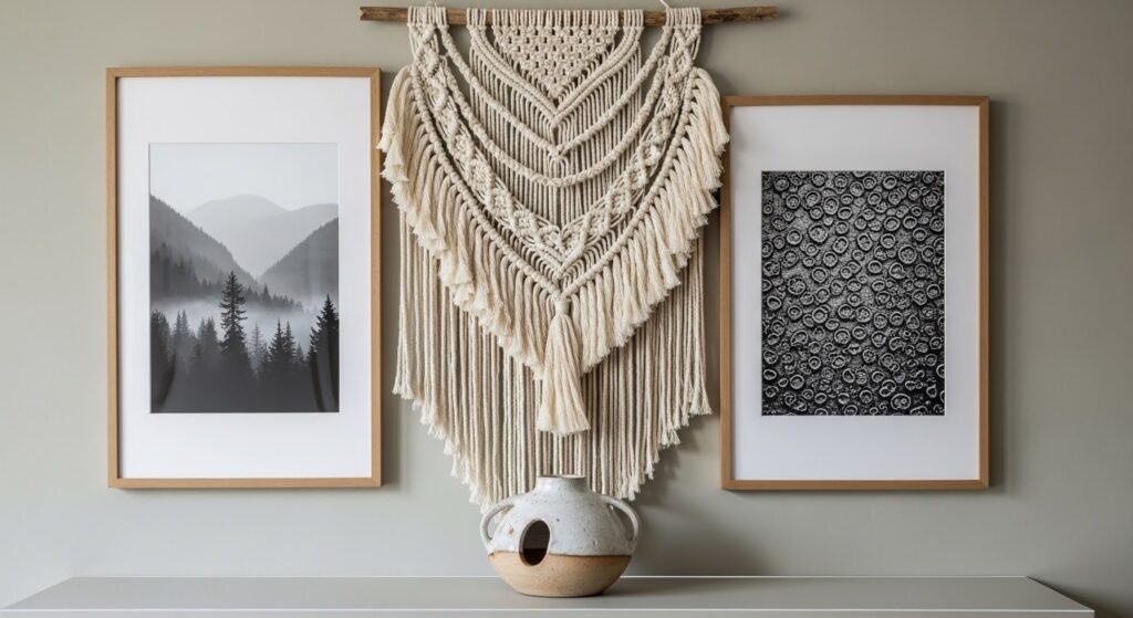
4. Mixing Textures Effectively
A wall made up entirely of flat framed prints can start to feel a little one-dimensional. The rooms that really stick in your memory usually have some layering going on — different materials, different finishes, different depths sitting comfortably alongside each other.
You don’t need to overthink this. Something as simple as pairing a woven hanging next to a framed photograph instantly adds visual richness. Even switching between a wooden frame and a thin metal one in the same grouping creates just enough contrast to make the arrangement feel curated rather than cookie-cutter.
Texture is also one of the best tools you have in a small space. A fiber art piece or a textured canvas takes up zero floor space, adds no clutter, and transforms a flat wall into something with genuine depth and character.
Combinations that tend to work well:
- A woven or macrame hanging alongside framed photography
- A metal wall piece or sculptural element next to a simple canvas
- Ceramic or clay wall objects paired with botanical or nature-themed prints
- Mirrors mixed with art — the mirror adds light, the art adds warmth
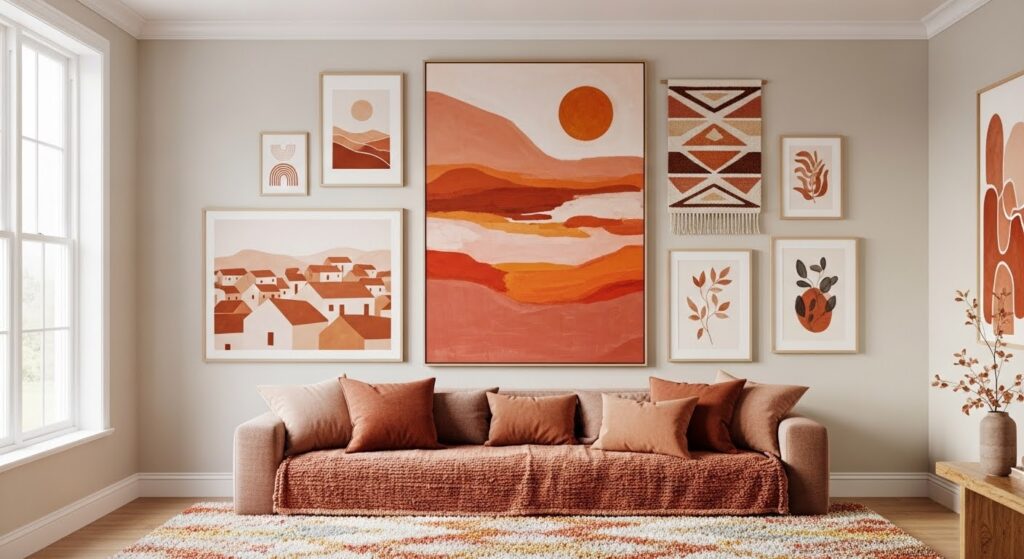
5. Color Coordination Tips
One of the most common misconceptions about wall decoration ideas is that your art needs to match your furniture. It really doesn’t. An exact match often looks stiff and a little try-hard. What you’re actually going for is harmony — a sense that everything in the room belongs in the same conversation, even if the individual pieces are doing different things.
The easiest way to create that harmony is to pick up on one or two colors already present in the room — your rug, your cushions, a throw blanket — and look for art that echoes those tones in some way. It doesn’t have to be exact. A rust-colored sofa and an earthy abstract print with ochre and terracotta will feel connected without being matchy.
Neutral rooms (think white walls, grey sofa, natural wood) are genuinely the most forgiving. Almost any artwork fits into a neutral space because the room isn’t competing with it. If your living room already has strong color, black and white photography is a wonderfully versatile option — it works with virtually everything.
Color pairing shortcuts:
- Lift one accent color from your existing textiles and look for artwork that features it
- Black and white photography is a safe, stylish choice that suits almost every room
- Warm tones like terracotta, amber, and rust feel natural alongside wooden furniture and warm neutrals
- Cooler tones like navy, sage, and grey work well in rooms with white walls, chrome details, or glass
6. Personal Touches That Work
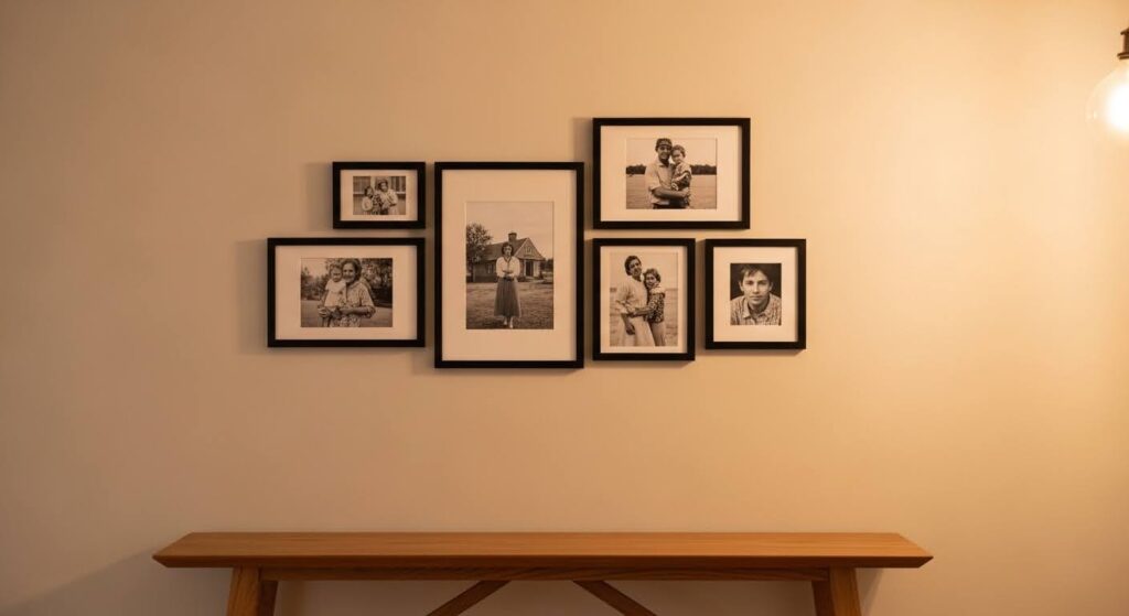
The living rooms people love most are the ones that feel genuinely lived in — rooms with a sense of a real person behind them. Generic art from a mass-market store has its place, but if every wall tells the same story, the room ends up feeling a little anonymous.
Personal photos are one of the best ways to add that quality, as long as you treat them like art rather than just sticking them up. Printing a few favorites in black and white and putting them in consistent frames immediately elevates them. Three or four photos displayed with real intention will always beat a crowded wall of twenty.
The same principle applies to travel mementos, inherited objects, or anything handmade. A meaningful piece on a small shelf next to a plant and a simple print becomes a considered vignette. Context is everything. When you give an object the right setting, it stops being just a thing and starts being part of the story the room is telling.
Personal items that translate well on walls:
- Black and white family or travel photos in matching frames, hung as a small deliberate grouping
- A single meaningful piece — something inherited, handmade, or brought back from a trip — as the main event on a wall
- City maps, illustrated prints, or hand-drawn artwork from places that matter to you
- A framed piece of handwriting, a meaningful quote, or a personal letter printed cleanly and simply
7. What to Edit Out
Editing is a skill, and for most people it’s actually harder than choosing what to add. But it matters. Pieces that were the right choice a few years ago, or that went up just because a wall looked bare, can slowly make a space feel tired without you even noticing.
Start by looking honestly at anything you no longer consciously see. If a piece has become wallpaper — technically visible but completely ignored — it’s probably not doing the room any favors. The same goes for anything that was bought purely to fill a gap rather than because you actually liked it.
As your taste evolves and your room changes, it’s also worth checking whether older pieces still belong in the story the space is telling now. Rooms grow and shift over time. Wall decor that made perfect sense once can quietly fall out of sync. There’s nothing wrong with taking something down, putting it away, and sitting with a blank wall for a while.
Signs something might need to go:
- You’ve completely stopped noticing it — it’s there but it no longer registers
- It doesn’t connect to anything else in the room in terms of color, texture, or style
- It went up because the wall was empty, not because the piece actually spoke to you
- The frame is worn or the print has faded and it no longer looks its best
- Your taste has moved on and the piece no longer feels like you
Common Mistakes to Avoid
Even people with a good eye slip up on these. They’re easy to avoid once you know what to look for, so it’s worth running through them before you pick up a hammer.
- Hanging art too high. By far the most common mistake. Art should sit at roughly eye level, meaning the center of the piece at around 57 to 60 inches from the floor. When it drifts up toward the ceiling, it loses its connection to the furniture and the room feels unanchored.
- Going too small. A little print perched above a full-length sofa looks like an afterthought. When you’re unsure, size up. One well-scaled piece always does more work than a cluster of pieces that are all slightly too small.
- Uneven arrangements. Before a single nail goes in, lay your planned gallery wall arrangement flat on the floor. It’s much easier to catch imbalances there than after you’ve made a dozen holes in the plaster.
- Clashing with the room’s style. Your art doesn’t have to match your furniture exactly, but it should speak a similar language. A very sleek, minimalist room and a busy, ornate frame arrangement are going to argue rather than complement each other.
- Decorating too fast. Buying everything in one afternoon and hanging it all the same weekend rarely ends well. Add pieces gradually, live with each one, and let the wall build up slowly and intentionally over time.
Frequently Asked Questions
Q1: How do I figure out what size wall art to get?
The most reliable approach is to measure the piece of furniture the art will sit above, then aim for artwork that spans roughly two-thirds of that width. If your sofa is 84 inches wide, you want a piece or grouping somewhere around 55 to 63 inches across. Before you buy anything, cut paper into the sizes you’re considering and tape them to the wall. It sounds low-tech, but it genuinely saves a lot of returns.
If you’re in a smaller room, resist the instinct to automatically go small. A single large piece often makes a compact room feel more intentional and pulled-together than several small pieces scattered around. Scale is about relationship and proportion, not just room size.
Q2: What height should I hang wall art?
The standard rule is to hang art so the center sits at 57 to 60 inches from the floor, which is roughly average standing eye level. This applies whether you’re hanging a single piece or treating a gallery grouping as one unit.
The one exception worth knowing: when art hangs directly above a piece of furniture, bring it down so there’s only about 6 to 8 inches of gap between the top of the furniture and the bottom of the frame. That connection is what makes art and furniture feel like they belong together. When art floats too far above a sofa, it looks like it’s trying to escape the room.
Q3: Can I mix different frame styles?
Absolutely, and it usually looks better than matching everything exactly. The key is finding a unifying thread that ties different frames together. That might be a shared finish (all matte black, all natural wood, all thin profiles), a consistent color story in the artwork itself, or a deliberate contrast limited to just two frame types so it reads as intentional rather than accidental.
The main thing to avoid is mixing more than two or three distinct frame styles in a single grouping. A touch of variety feels curated. Too much variety feels like a jumble. When in doubt, keep the frames quieter and let the art itself carry the visual interest.
Q4: How do I handle a really large blank wall?
Large walls are genuinely exciting to work with once you approach them with some confidence. A single oversized canvas can be incredibly striking and is often the cleanest solution. A gallery wall that spans the full width of a sofa, a large mirror flanked by smaller pieces, or a combination of art and a floating shelf with objects can all work beautifully too.
The one thing that tends not to work: filling a large wall with lots of small pieces in no particular arrangement. That usually reads as chaos rather than decoration. Treat smaller pieces as a unified gallery wall with deliberate spacing, or go larger. Check out our guide to Gallery Wall Ideas for detailed advice on spacing and layout.
Q5: Does my wall decor need to match my furniture?
Matching isn’t the goal — harmony is. When art frames are the exact same wood as your coffee table and prints are the precise color of your cushions, it tends to look a bit studied and self-conscious. You want things to feel like they belong in the same world, not like they were selected by running everything through a color-matching app.
The most flexible approach is to build your wall decor choices around a consistent mood or color story rather than trying to mirror specific furniture pieces. If your room leans warm, earthy artwork will feel natural. If it leans cool and modern, something crisp and minimal will fit right in. Also worth exploring: Living Room Shelf Decor — shelves and wall arrangements often work best when they’re designed together.
Final Thoughts
There’s no single formula for getting living room walls right, and that’s actually a good thing. The best-looking rooms are the ones that reflect the real person living in them — built up gradually, edited thoughtfully, and not finished all in one weekend.
Start with one wall. Choose one piece you genuinely love, hang it at the right height, and see how it feels. From there, everything else becomes a conversation rather than a checklist. You’ll know when something works and when it doesn’t, and that instinct gets sharper the more you practice trusting it.
| Ready to take it further?Head over to our complete guide on Modern Living Room Wall Decor for style-specific inspiration — from clean minimalist setups to rich, maximalist arrangements — along with advice tailored to specific room sizes and aesthetics |