
Neutral Living Room Ideas: Timeless Colors That Work
You know that moment in the paint aisle when you’re holding a dozen swatches and somehow feeling more confused than when you walked in? Yeah. That’s one of the most universal experiences in home decorating, and it happens to almost everyone. There are just too many options and not enough clear direction on what actually works, especially once you factor in a smaller apartment where the stakes feel higher.
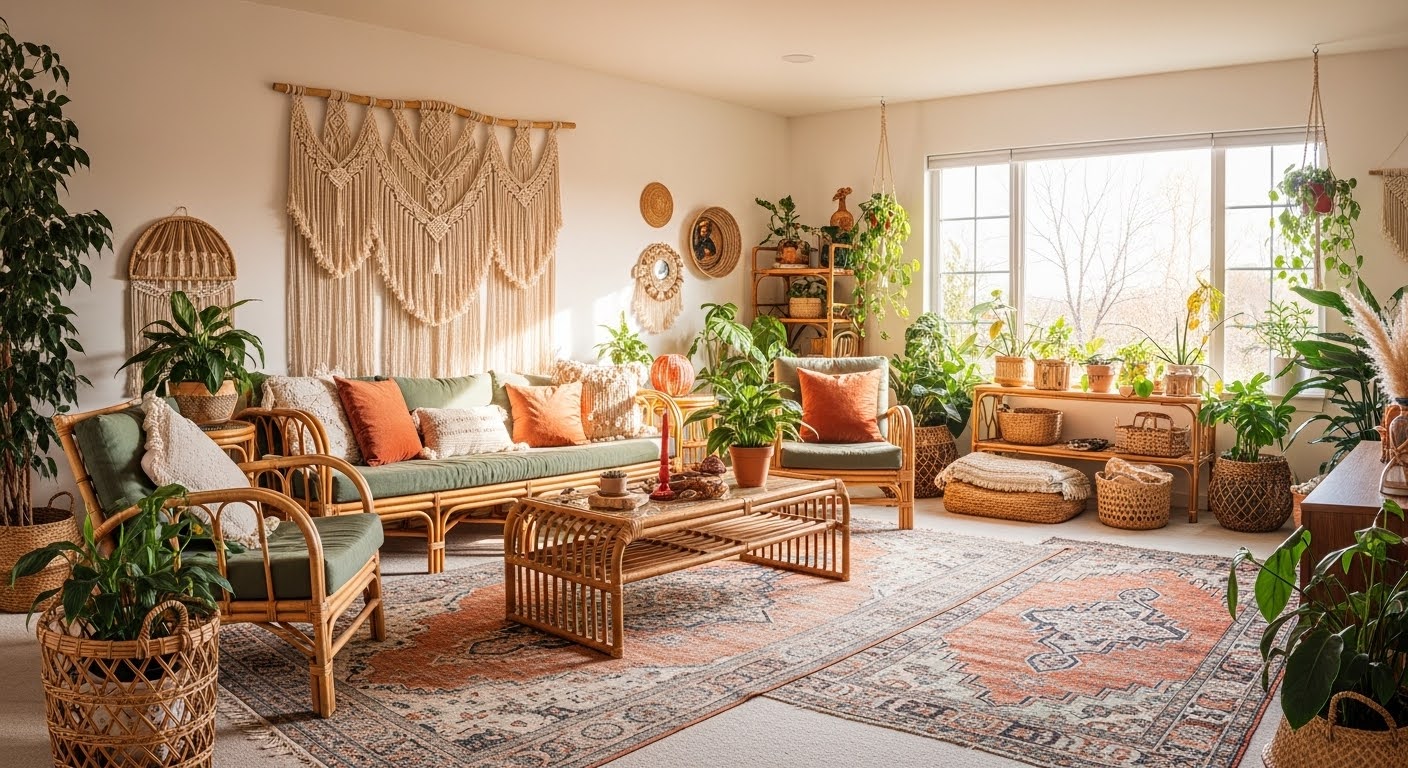
Here’s the thing, though — neutral living room ideas have quietly become the smartest starting point for beginner decorators, and not because they’re the safe or boring choice. Done right, a neutral palette is endlessly flexible. It works with almost any furniture style, it adapts when your taste shifts, and it photographs beautifully without trying hard. It gives you something to build on rather than something to work around.
In this guide, you’ll find out which neutral tones do the most work in a small space, how to layer colors so the room feels rich and designed rather than beige by default, and a simple method for testing paint shades before you spend anything on supplies. Let’s get into it.
Quick Summary
WHO THIS IS FOR
Home decor beginners and small-space apartment dwellers
TIME TO READ
6 min
TOP 3 TAKAWAYS
1. Why Color Matters More in Small Spaces
In a large room, color is mostly about mood. In a small space, it’s also about perceived size — and that distinction matters a lot when you’re working with limited square footage. Light bounces off warm neutrals differently than it does off stark whites or saturated colors, and the visual effect can make the same room feel either open and airy or surprisingly cramped.
The walls in a compact living room take up a much bigger share of your visual field than they would in a sprawling space. A color that looks subtle on a sample chip at the store can feel intense and heavy once it covers every vertical surface. This is exactly why so many people end up repainting — they underestimated how much the color would dominate at full scale.
Getting your neutral color palette living room right from the beginning saves money, time, and the very specific frustration of looking at a shade you already don’t like. It also gives every other choice you make — your rug, your sofa, your art — a consistent backdrop to work against.
A few things neutral colors reliably do in small rooms:
- Light neutrals reflect natural and artificial light, making rooms feel larger and brighter
- Warm-toned neutrals add coziness without shrinking the visual footprint
- Consistent wall color throughout an open-plan space reduces visual clutter
2. Best Light Colors for Small Living Rooms
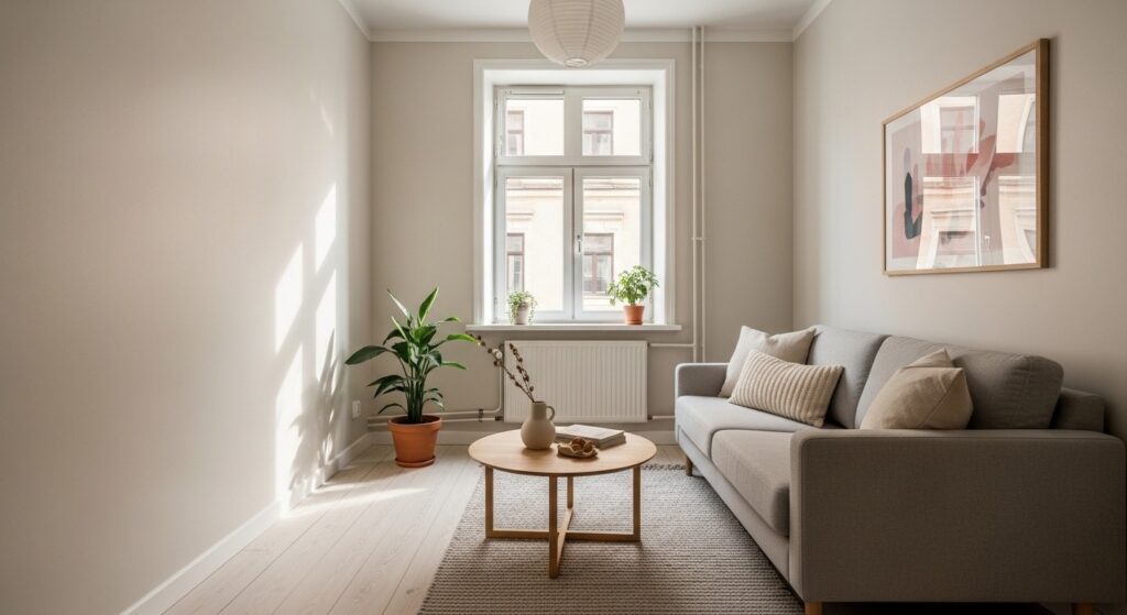
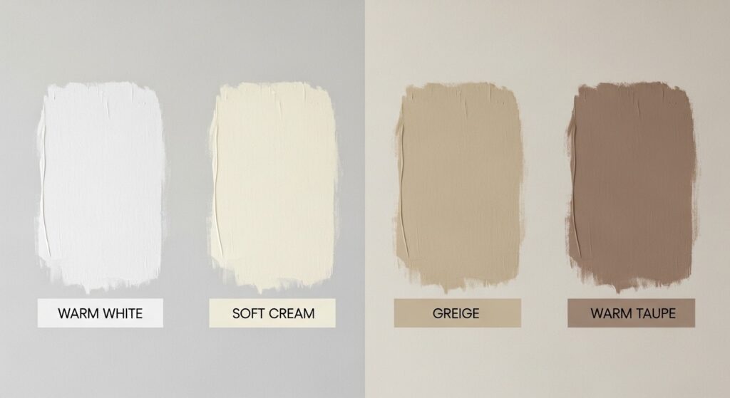
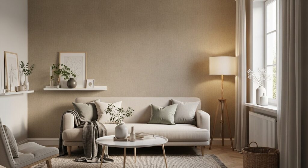
When most beginners think “neutral,” they picture a clean, cool white — and then end up with something that reads slightly blue or grey in evening lighting and feels oddly clinical. The truth is that warm whites, soft creams, and true beige living room shades consistently outperform stark whites in residential spaces. They’re warmer in person, they work better with wood furniture, and they look more natural in photos without any extra effort.
Greige — the blend of grey and beige that became a design staple for good reason — is probably the most reliable choice for someone decorating a neutral space for the first time. A well-chosen greige reads as sophisticated and cool in bright daylight and genuinely cozy once the lamps are on. It pairs with almost everything: warm oak furniture, white trim, rattan accents, any upholstery color you can think of.
If greige feels a little safe for you, explore warm taupes or dusty linen tones instead. These carry a subtle color story — they have personality without being overtly colorful. They tend to perform especially well in rooms with limited natural light, where a cool-leaning neutral would start to feel flat or washed out by mid-afternoon.
3. Can You Use Dark Colors? (Yes, Here’s How)
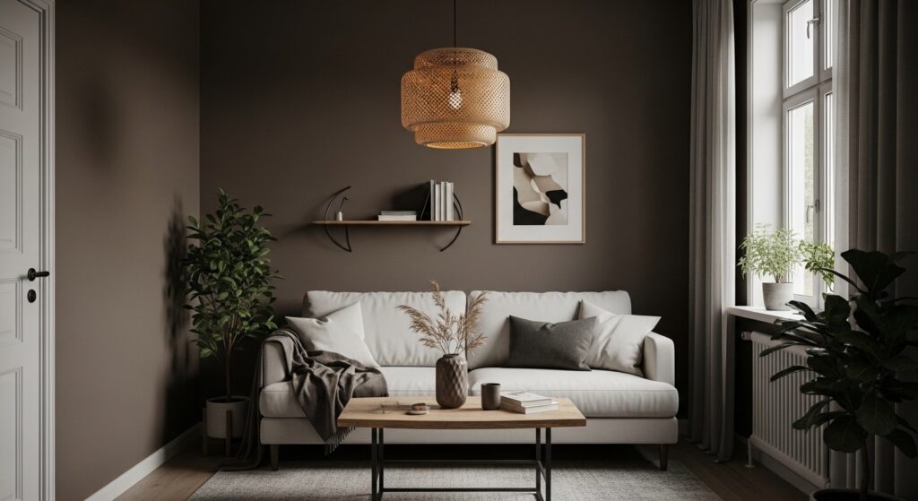
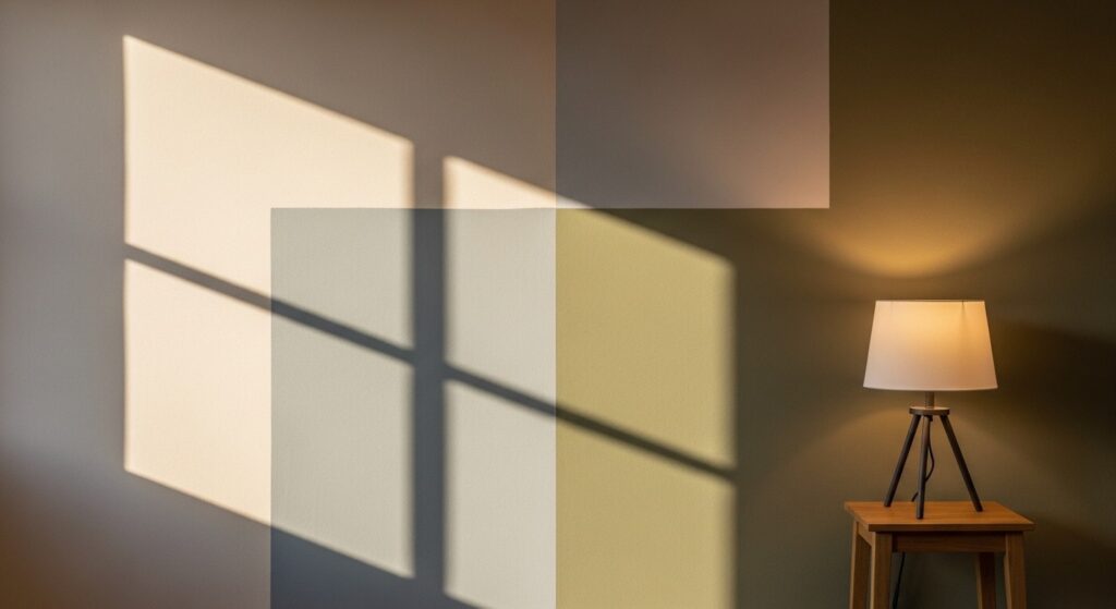
This might be the most counterintuitive tip in this whole guide: dark colors in a small room don’t always make it feel smaller. In fact, when you commit to them properly, a deep warm neutral — a rich mushroom brown, a dark clay, a moody warm caramel — can make a small space feel curated and intentional in a way that lighter colors simply can’t achieve.
The key word there is commit. If you paint one wall dark and leave the rest light, the contrast can feel abrupt and unfinished. But when you take a saturated neutral and wrap all four walls in it, something interesting happens — the room develops a sense of depth and atmosphere that’s surprisingly luxurious. Add warm-toned floor and table lamps, and the result looks deliberate and refined rather than heavy.
This works best when your furniture has at least some lighter elements — a cream sofa, natural wood tones, woven textures. If everything in the room is dark, the space can feel enclosed in the wrong way. Balance is the goal, and mirrors help enormously by bouncing light back across the room.
Things to keep in mind if you go darker:
- Paint all walls the same shade for a cohesive, intentional look — partial dark accent walls can feel jarring
- Use warm-toned lighting rather than cool overhead LEDs to keep the space from feeling dim
- Balance dark walls with at least one or two light-toned furniture pieces
- Mirrors are your best friend in a dark-walled room — place them to reflect natural light
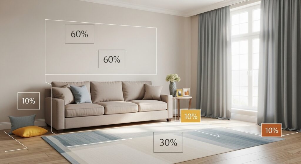
4. The 60-30-10 Color Rule Explained
If there’s one framework worth memorizing before you start any decorating project, this is it. The 60-30-10 rule gives you a simple, reliable way to balance color across a room without needing any formal design training. Here’s how it breaks down: 60% of the room should be your dominant color, 30% your secondary, and 10% your accent.
In practice, your 60% is almost always the walls (or walls plus a large sofa, if they share a similar tone). Your 30% covers secondary furniture, your rug, or your curtains. And your 10% — the smallest slice — is where you get to bring in personality: throw pillows, a lamp, a decorative object, a single piece of art in a more expressive color. That 10% layer is what makes a neutral room feel designed rather than accidental.
The beautiful thing about using this rule in a neutral color palette living room is that the 10% is completely swappable. Change your throw pillows from terracotta to forest green and the whole room shifts mood without touching a single wall. It’s basically a built-in refresh button, which is incredibly useful in a rental or a space you’re still figuring out.
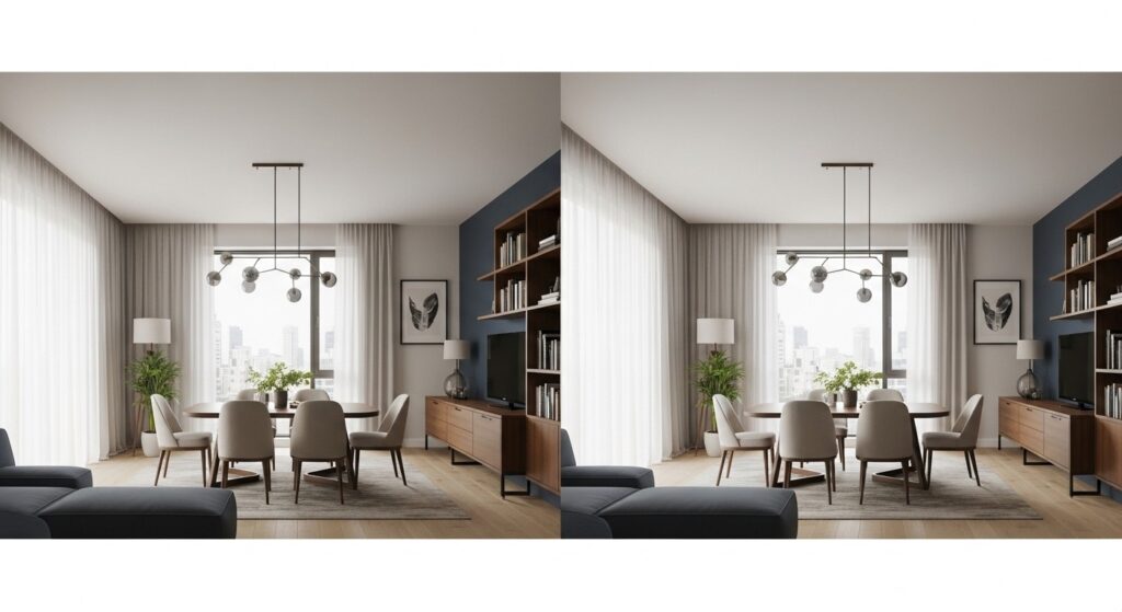
5. Accent Wall Ideas for Small Rooms
An accent wall gives a small living room a clear focal point without asking you to commit every surface to something bold. In a neutral scheme, the most successful accent walls keep the contrast subtle — a deeper tone from the same color family rather than a completely different hue. This reads as intentional rather than indecisive, and it keeps the space visually cohesive.
The wall behind your sofa or media unit is almost always the right candidate. It anchors the primary seating area and naturally draws the eye. If you prefer texture over color, a wallpaper with a linen, grasscloth, or quiet geometric pattern in a warm neutral can do the same job beautifully — adding dimension without pulling the room in a new direction.
And you don’t always need paint or wallpaper to create that effect. A thoughtfully arranged gallery wall in matching frames, a large woven hanging, or even floor-to-ceiling shelving styled with books and a few objects can serve as a visual anchor with zero painting required. This is especially useful in rentals where you can’t alter the walls permanently.
6. Ceiling Color: Match or Contrast?
Most people paint their ceiling standard bright white on autopilot — and honestly, in a lot of rooms that’s the right call. But in a neutral living room, you’ve got an opportunity to use the ceiling as a fifth wall that either opens the space up visually or wraps the room in a more enveloping, boutique-style feel.
If your walls are a warm cream or greige, painting the ceiling the same color (or just one shade lighter) removes the visual “lid” that a high-contrast white ceiling creates. This is particularly effective in apartments with lower ceilings, where a bright white overhead actually highlights the low height by creating a strong line of contrast at the top of the wall.
On the other end of the spectrum: matching your ceiling exactly to your walls creates a wrapped, immersive effect that feels surprisingly luxurious in a small room. It’s an underused technique that tends to impress guests more than almost any other simple decorating decision — mostly because so few people try it.
Quick ceiling color guide:
- Match ceiling to walls: creates a cozy, enveloping effect — great for apartments with lower ceilings
- One shade lighter than walls: adds subtle height without a jarring contrast line
- Bright white against neutral walls: classic and clean, works best in rooms with generous ceiling height
7. How to Test Paint Colors Before Committing
The single most common painting mistake is picking a color from a tiny chip under fluorescent store lighting and then being surprised when it looks completely different at home. Every experienced decorator has a story about this. The good news is it’s completely avoidable, and the fix is simple.
Buy sample pots of your top two or three choices and paint large swatches directly on the wall — at least 12 by 12 inches, ideally bigger. Check them at different times of day: morning light coming through the window, midday when the room is brightest, and evening with your actual lamps on. A greige living room color that reads warm and golden in the morning can shift noticeably toward lavender or sage under certain artificial lighting.
Live with those swatches for at least two full days before you decide. That’s it. Two days, no rushing. It’s the cheapest and most reliable way to avoid spending money on a color you’ll hate in three months.
The short checklist:
- Paint swatches at least 12 x 12 inches — small chips are genuinely misleading about full-wall impact
- Test in multiple spots: by the window and in a darker corner will look like different colors
- Hold the swatches against your actual sofa and flooring — not just the wall
- Check at three different times of day before making a final call
Reading More About – Modern Farmhouse Living Room Ideas
Common Mistakes to Avoid
Even with a perfect neutral palette in mind, a few common oversights can undermine the whole project before you’ve opened a single can. Here’s what to watch for.
| Not measuring firstKnowing your wall square footage before you buy paint isn’t just helpful — it saves you from running back to the store mid-project. Different production batches can vary slightly in tone, so buying it all at once keeps your finish consistent. |
| Ignoring what’s already in the roomYour flooring, sofa, and trim are fixed. Your wall color needs to work around them, not the other way around. Always hold your paint swatches next to your existing furniture before committing. |
| Chasing trends over your own tasteThe beige that’s everywhere on social media right now might not suit your light, your furniture, or your personality in six months. Choose a neutral you genuinely love looking at, not just one you’ve seen on someone else’s feed. |
| Skipping the planning phaseJumping straight to painting without thinking through your 60-30-10 layers, accent pieces, and ceiling treatment is the most common reason rooms end up feeling unfinished. Even a rough sketch on paper changes everything. |
Frequently Asked Questions
| What’s the most important element to focus on first? |
| Start with your largest fixed element — usually your sofa or your flooring. These are the pieces you’re least likely to replace anytime soon, and every other color decision should build outward from them. If your sofa is a warm tan or medium oak floors are already in place, you’re halfway to a great beige or greige living room because the tones are already doing the work.Once you’ve got an anchor color in mind, choose your wall color next. Walls cover the most surface area and carry the biggest visual weight in the room. Nail those two elements and everything else falls into much cleaner alignment.Accessories come last — always. One of the most common beginner mistakes is buying throw pillows and art before the foundational colors are settled, then spending weeks trying to make everything work together. Save the fun stuff for the end. |
| How do I start this project if I’ve never painted before? |
| Start with just one wall, and make it a low-profile one — the wall behind the door or a side wall rather than the focal point of the room. Treat it like a practice run. You’ll get comfortable with rolling technique, cutting in around trim, and managing drying time, all without the pressure of it being the first thing you see when you walk in.Spend real time on prep before you open any paint. Wipe down the walls with a damp cloth, fill any small holes with lightweight spackle, and let it dry fully. Apply painter’s tape carefully along trim and the ceiling line. Good prep is genuinely unglamorous, but it’s what separates a clean finish from one that looks slightly off.Use a primer if your walls are very light (going significantly darker), very dark (going lighter), or if you’re switching between color families with different undertones. Primer helps the final color read accurately and usually reduces the number of coats you need, which saves both time and paint. |
| What’s a realistic budget for a living room color refresh? |
| For a small apartment living room — roughly 200 to 300 square feet of wall space — budget somewhere between $80 and $200 for quality paint, primer, and supplies if you’re doing the work yourself. Higher-end paints typically cost more upfront but usually require fewer coats, which can make the total paint cost fairly comparable to a cheaper option applied three times.If you’re starting from scratch on tools, add another $25 to $35 for a roller, tray, brushes, painter’s tape, a drop cloth, and a basic putty knife for filling small holes. These tools are reusable, so treat them as a one-time investment rather than a per-project cost.Peel-and-stick wallpaper for a single accent wall ranges quite a bit depending on the brand and material, but budgeting an additional $60 to $150 for a small wall is reasonable if you want a textured or patterned effect. It’s also far more renter-friendly than traditional wallpaper since it’s fully removable. |
| How long does a living room color refresh take? |
| If you’re painting all four walls of a small living room by yourself, plan for a full weekend. Day one covers prep — cleaning walls, filling holes, letting them dry, taping, and priming — plus your first coat of color. Day two covers the second coat and any touch-up work. The biggest mistake people make is rushing the drying time between steps, which is where uneven finishes come from.If you’re refreshing just one wall or repainting over a very similar existing color, you can often wrap up the project in a single afternoon. The prep phase is always the part that takes longer than expected — the actual painting usually goes faster than beginners assume.Once the final coat is dry to the touch (typically one to two hours), resist the urge to immediately press furniture back against the walls. Give the paint a full 24 hours before anything makes contact with it, and ideally a week before hanging anything heavy. Paint needs time to fully cure and harden, and skipping this step can leave marks or impressions that are genuinely hard to fix. |
Ready to Start Your Neutral Living Room Refresh?
Neutral living room ideas work so well because they give you a foundation that’s genuinely flexible over time. You can build on them, evolve them, adapt them to new furniture or a different season without starting from scratch. Whether you lean into soft creams, settle on a greige living room palette, or experiment with something moodier and deeper on one wall, the core principles stay the same: test colors properly, use the 60-30-10 framework to balance your tones, and let the layers do the work so nothing feels forced.
The best living room is one that actually feels like yours. Start with a color you genuinely like looking at every day — not just one that’s popular right now — test it carefully, and don’t overthink everything else. A well-chosen neutral on your walls can completely change how a space feels to live in, and it’s one of the most satisfying, accessible projects you can take on yourself.