
Gallery Wall Ideas for Living Room: Curate Your Collection
Staring at a blank wall in your living room can feel surprisingly intimidating. You know you want something there — something personal, layered, and a little stylish — but where do you even begin? If you’ve ever opened a home decor app, felt instantly overwhelmed, and closed it again, you’re not alone.
Here’s the good news: creating a gallery wall living room display is one of the most beginner-friendly decorating projects you can take on. You don’t need a design degree, a huge budget, or a perfectly curated life. You just need a simple plan and a few tricks that experienced decorators already know.
In this guide, you’ll discover exactly how to design a photo wall living room display that feels intentional — not chaotic. From choosing your layout to hammering the final nail, we’ll walk through every step together.
Quick Summary
WHO THIS IS FOR
Home decor beginners, anyone looking to refresh their living room
TIME TO READ
8 min
TOP 3 TAKAWAYS
1. Gallery Wall Planning
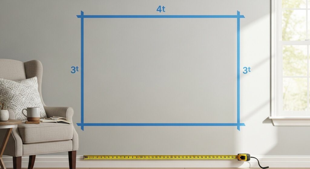
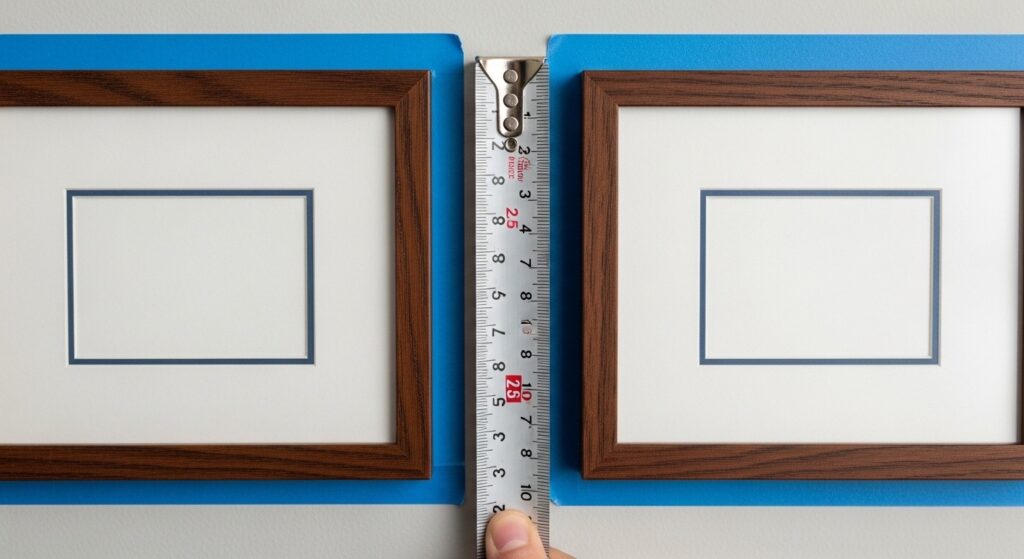
Before you buy a single frame, spend ten minutes with a tape measure. Know your wall dimensions, note where your sofa or furniture sits, and mark the general area you want to fill. Skipping this step is the number one reason gallery walls end up looking off.
Think about the mood you want the space to carry. A living room gallery wall can feel warm and personal with family photos, or clean and editorial with black-and-white prints. Your room’s existing palette and furniture style will guide which direction feels right.
Once you have a sense of size and mood, take a phone photo of the wall. You’ll use this as a reference when you start laying out frames on the floor — a game-changing trick that saves unnecessary holes in your walls.
Planning checklist:
- Measure wall width and height before shopping for frames
- Note the height of nearby furniture so art doesn’t clash
- Photograph the wall for reference while planning
- Decide on a mood: personal and cozy vs. curated and editorial
2. Layout Templates That Work
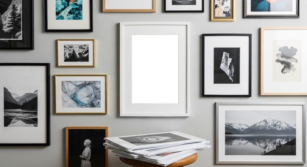
You don’t need to reinvent the wheel when it comes to art arrangement ideas. A few tried-and-true layouts work beautifully in almost any living room, whether it’s a compact studio or a larger open plan space.
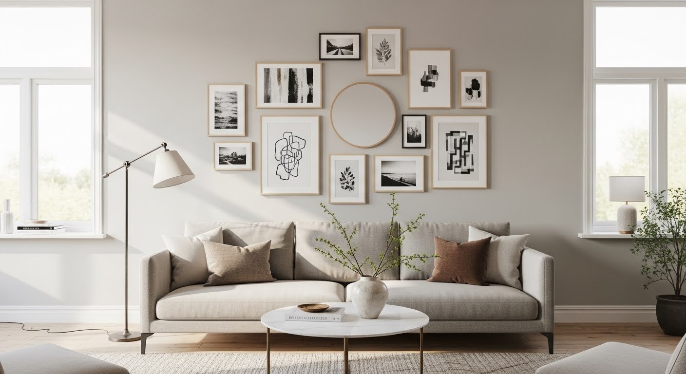
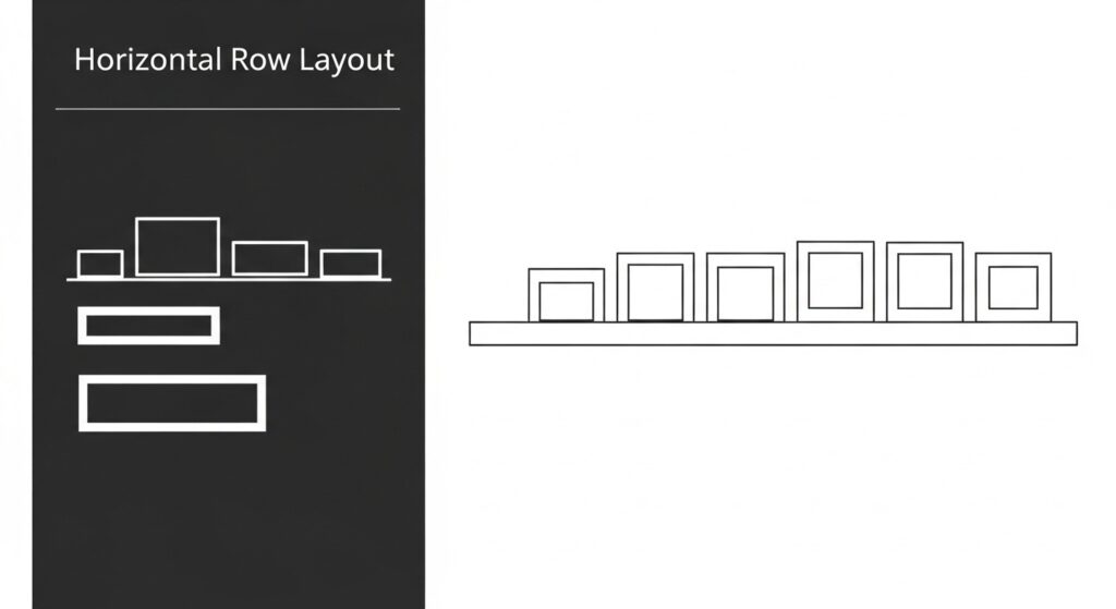
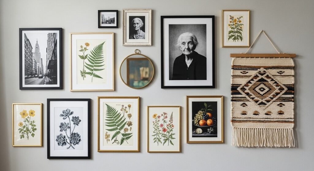
The grid layout uses frames of identical size arranged in neat rows and columns. It’s minimal, modern, and very forgiving for beginners. The salon-style arrangement is its opposite — a loose, floor-to-ceiling mix of sizes that feels collected over time. For small apartments, a horizontal row of three to five pieces above the sofa hits the sweet spot between simple and styled.
Pick one template and commit to it before you start. Mixing approaches mid-project leads to restarts, frustration, and extra nail holes.
Layout options at a glance:
- Grid: Same-size frames, even spacing — great for minimalists
- Salon style: Mixed sizes, densely packed — great for maximalists
- Horizontal row: 3–5 pieces in a line — great for beginners and small walls
- L-shape or staircase: Follows a corner or stairwell — great for awkward walls
3. Frame Selection and Mixing
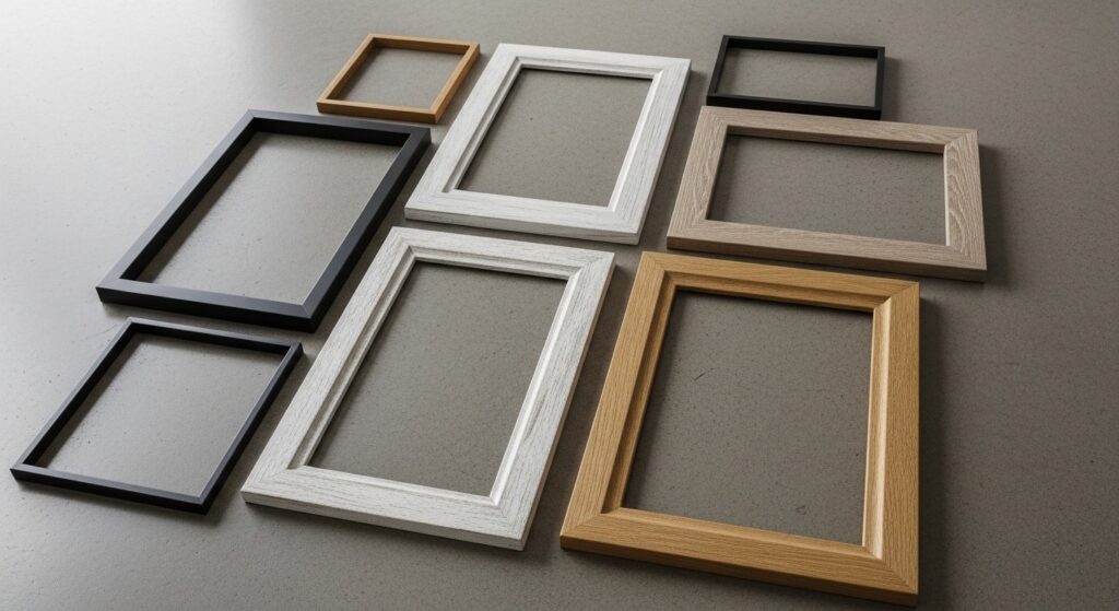
Matching frames look polished. Mixed frames look collected. Both approaches work — the key is picking one direction and staying consistent within it. If you mix frames, unify them through color (all black, all wood tone, all white) or all-matching mats inside different frames.
For a photo wall living room display, you don’t need to spend a lot. Thrifted frames painted the same color can look just as intentional as a matching set. Odd numbers of frames tend to feel more dynamic than even numbers, especially for asymmetric arrangements.
Don’t overlook non-frame elements. Woven wall hangings, small mirrors, and sculptural objects add texture and depth to any gallery wall. Just limit these accent pieces to two or three so they support the display rather than compete with it.
Frame mixing tips:
- Unify mixed frames with a consistent finish (all black, all natural wood)
- Odd numbers of frames feel more organic than even
- Add 1–2 non-frame elements for texture (mirror, woven piece, small shelf)
- Use mats inside frames to make small prints feel more substantial
4. Spacing and Alignment
Consistent spacing is what separates a gallery wall that looks designed from one that looks accidental. The sweet spot for gaps between frames is 2 to 3 inches. Any more and the grouping starts to feel scattered. Any less and frames compete visually.
For a picture wall layout, think of the entire arrangement as one large shape on the wall. That shape should be centered on a focal point — typically the center of your sofa or a fireplace. The center of the overall arrangement should sit at eye level, which is roughly 57 to 60 inches from the floor.
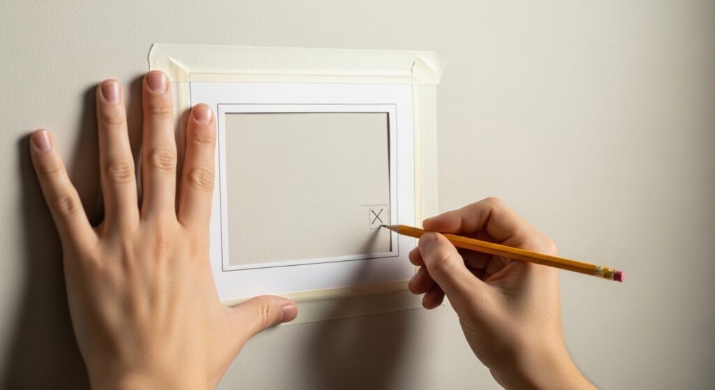
Use painter’s tape on the wall before hanging anything. Map out each frame’s position, step back, and live with it for a day. You’ll catch problems — like a lopsided grouping or a gap that’s too large — before a single nail goes in.
Spacing rules to follow:
- Keep gaps between frames at 2–3 inches
- Center the overall arrangement at 57–60 inches from the floor
- Use painter’s tape to mock up the full layout before hanging
- Treat the entire grouping as one visual unit, not individual pieces
5. What to Include
A gallery wall is at its best when it tells a story about you. That story doesn’t have to be literal. Mix personal photos with art prints, meaningful quotes, or objects that represent places you’ve been or things you love.
For beginners, a great starting formula is: 60% prints or art, 30% personal photos, 10% objects or textiles. This ratio keeps the wall from feeling like a photo album while still making it personal. You can always adjust as your style evolves.
Print-on-demand services make it easy to turn your own travel photos or artwork into framed prints. Look for pieces with similar undertones (warm or cool) so your collection feels cohesive even when the subjects vary widely.
What to consider including:
- Art prints in varied sizes (abstract, botanical, typographic)
- Personal photos printed in consistent black-and-white or sepia
- Small mirrors to add light and depth
- Meaningful objects: a vintage map, a pressed flower frame, a small shelf
- Postcards or illustrations from places you’ve visited
6. Hanging Techniques
For renters, damage-free hanging strips are a genuine game-changer. Modern adhesive strips hold frames weighing up to several pounds, and they remove cleanly. Always check the weight rating before using them, especially for larger frames.
For frames you’re confident about keeping long-term, a nail into a wall stud is the most secure method. Use a stud finder — or knock gently along the wall and listen for the solid thud that indicates a stud. For drywall between studs, use appropriate anchors for heavier pieces.
The paper template trick saves time and keeps your holes accurate. Trace each frame on paper, mark the hook location, tape the template to the wall, and nail straight through the paper. Tear it away and hang the frame — perfectly placed every time.
Hanging method quick guide:
- Use adhesive strips for renters — check weight limits carefully
- Nail into studs for heavier frames or permanent arrangements
- Try the paper template method for precise placement every time
- Use a level on every single frame — even small tilts are visible
7. Updating Your Gallery
A gallery wall isn’t meant to be permanent. One of its biggest advantages over a single large piece of art is how easy it is to refresh. Swap out one or two prints seasonally to keep the display feeling current without starting over.
As your life changes — new travel, new interests, growing family — let your gallery wall grow with it. Keep a small folder of prints or photos you love but haven’t used yet. Rotation is faster and cheaper than redecorating an entire room.
If a frame’s finish feels dated, a quick coat of spray paint transforms it. This is especially useful for thrifted or mismatched frames you want to unify into a new color direction without spending on replacements.
Easy refresh ideas:
- Swap 1–2 pieces per season to refresh without rehanging everything
- Keep a ‘waiting list’ folder of prints you want to rotate in
- Spray paint old frames to unify mismatched sets into a new look
- Add seasonal elements temporarily — dried flowers, a holiday card, seasonal prints
8. Gallery Wall Mistakes to Avoid
Even experienced decorators make these errors. Knowing them in advance saves you time, money, and frustration. All four are planning mistakes — meaning you catch them before a single nail goes in.
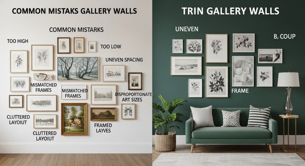
- Hanging too high. Most people hang art at eye level for someone standing. The actual target is 57–60 inches to the center of the piece — lower than you think.
- Going too small for the space. A single 5×7 above a full sofa looks lost. Scale your arrangement to at least two-thirds the width of the furniture below it.
- Unbalanced arrangements. When all the large frames cluster on one side, the wall feels heavy on that end. Distribute visual weight — large and small pieces — across the whole arrangement.
- Ignoring the room’s style. A boho-inspired gallery wall of macramé and warm botanicals will clash in a sleek minimalist room. Match the wall’s energy to the existing space.
9. Frequently Asked Questions
| Q1: What’s the most important element to focus on when creating a gallery wall living room display? |
| Cohesion is everything. Your frames, prints, and objects don’t have to match — but they should feel like they belong together. Pick one unifying element: a color palette, a frame finish, or a consistent subject matter like travel or nature. Without at least one thread tying pieces together, the wall reads as clutter rather than a curated collection. Start there, and the rest of the decisions become much easier. |
| Q2: How do I start this project if I’ve never done it before? |
| Start on the floor, not the wall. Gather every frame and print you’re considering, lay them on the floor in front of the wall, and arrange them until you like what you see. Photograph your floor layout from above. That photo becomes your hanging guide. Don’t buy anything new until you’ve exhausted what you already own — you’ll often find you have more than you think. |
| Q3: What’s a realistic budget for a gallery wall living room project? |
| You can create a beautiful gallery wall for as little as $30 to $50 using thrifted frames, printed-at-home artwork, and a can of spray paint to unify everything. A mid-range approach using a mix of new and secondhand frames with print-on-demand art typically runs $100 to $200. Going all-new with a matching frame set and professionally printed art can cost $300 or more. The look rarely reflects the spend — creativity matters far more than budget here. |
| Q4: How long does it take to create a gallery wall from start to finish? |
| Planning takes the longest — expect one to two hours to gather pieces, lay out options, and finalize your arrangement. The actual hanging, once your layout is confirmed, usually takes 30 to 60 minutes for a standard sofa-width arrangement. Budget an extra hour if you’re using the paper template method for the first time. Most people are pleasantly surprised how fast the physical hanging goes once the planning is done. |
| Q5: What are the most common mistakes to avoid with a picture wall layout? |
| The four biggest pitfalls are hanging art too high, choosing pieces too small for the wall, creating visual imbalance by clustering large pieces together, and ignoring how the gallery fits the room’s overall style. The good news is that all four are planning mistakes, not hanging mistakes — meaning you catch them before a single nail goes in if you take time to lay everything out on the floor and tape a mock-up on the wall first. |
10. Conclusion
A gallery wall living room display is one of the most rewarding decorating projects you can take on — especially in a small apartment where every design choice matters. It’s personal, flexible, affordable, and genuinely transforms how a space feels. You’re not just filling a wall; you’re building something that tells your story.
Start small if you need to. Even three frames above a sofa, hung with intention and consistent spacing, make an enormous impact. As your confidence grows, so can your gallery. You’ve got everything you need to make it happen.
Related: Wall Decor Ideas for Living Rooms • DIY Living Room Decor • Modern Living Room Ideas