
Warm Color Living Room Ideas: Rich Tones That Invite
You want your living room to feel like the kind of place people actually want to sit in. Somewhere that feels pulled together, cozy, maybe even a little special. But every time you start browsing inspiration photos, doubt creeps in. Will rich, golden walls make your small apartment look even smaller? Can you really pull off terracotta without it feeling like a bad decision you’re stuck living with? These are completely fair questions, and a lot of people get stuck at exactly this point.
Here’s the thing, though: warm color living room ideas work in almost any space once you understand how color actually behaves. Small rooms aren’t the obstacle you might think they are. In fact, the right warm palette can make a compact living room feel more intentional and more inviting than a room twice the size that’s been painted a forgettable shade of gray.
In this post, you’ll learn which warm tones open up a room instead of closing it down, how to use a single accent wall to bring in richness without committing to a full repaint, and how one simple design rule takes practically all the guesswork out of choosing colors. Let’s get into it.
Quick Summary
WHO THIS IS FOR
Beginner decorators and anyone ready to refresh their living room with warmth and personality.
TIME TO READ
5 min
TOP 3 TAKAWAYS
Why Color Matters More in Small Spaces
In a compact living room, color does a lot of the heavy lifting. It shapes how large or small the space feels, sets the mood, and signals whether the room was put together with intention. When you’re working with limited square footage, every wall and textile choice becomes part of one unified story — and color is the thread running through all of it.
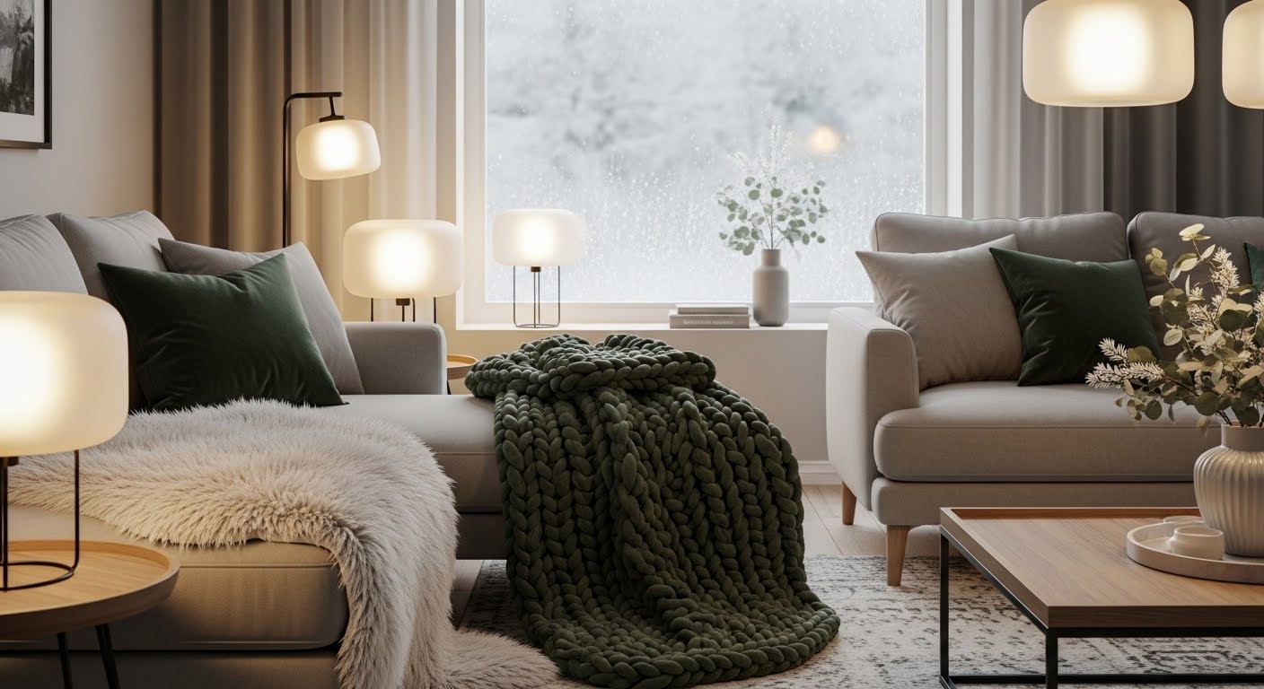
Warm tones carry a kind of psychological weight that cooler colors don’t. Shades like terracotta, amber, and ochre have a way of making people relax. They lower the perceived formality of a room and make it feel like somewhere you can actually breathe. It’s why so many people feel instantly comfortable in spaces built around an earth tone living room palette — there’s something almost instinctively welcoming about them.
The important distinction to make is this: warm colors don’t automatically make small rooms feel smaller. Dark, heavily saturated tones can do that if you use them the wrong way. But lighter warm shades actually bounce light beautifully and build a sense of comfortable enclosure rather than confinement. Understanding that difference is where your confidence as a first-time decorator really starts.
- Color shapes the illusion of space — and you’re in charge of it
- Warm tones build a sense of arrival and emotional comfort
- The right warm palette works in studios, one-bedrooms, and compact apartments
- Light bounces off warm neutrals in a way that often flatters a room more than stark white
Best Light Colors for Small Living Rooms
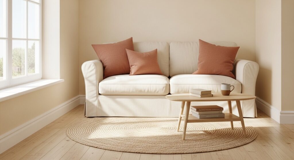
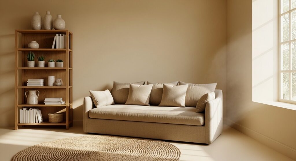
If you’re building a warm tones living room in a small space, the smartest place to start is with a light, creamy warm neutral on your walls. Think soft ivory, warm sand, honey beige, or a very pale terracotta blush. These shades reflect both natural and artificial light without carrying the clinical chill that comes with a bright, cool white. Your room ends up feeling larger and more welcoming at the same time.
The trick is picking a warm white with a clear undertone direction. A white with yellow or red undertones reads cozy and enveloping. A white with blue or gray undertones reads cold and corporate, even when the label says “warm.” Before you buy a full gallon, always test your paint sample against your actual floor and furniture — in daylight and under lamplight both. Undertones shift more than you’d expect depending on your room’s light source.
For an earth tone living room in a smaller space, pairing a light warm wall color with natural textures like linen, jute, and raw wood goes a long way. The textures add visual depth and richness so the room doesn’t read as flat, even when you’re keeping the color palette controlled and relatively quiet.
- Warm ivory — timeless, pairs well with both wood and brushed metal accents
- Honey beige — grounding and rich without pulling the room into darkness
- Pale terracotta blush — a soft entry point into the terracotta living room trend
- Butter cream — radiates warmth even in north-facing rooms with little natural light
- Warm greige — the versatile workhorse of the warm neutral family
Can You Use Dark Colors? (Yes, Here’s How)
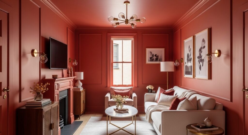
This is the part that tends to surprise people who are new to decorating: deep, rich warm tones can absolutely work in a small living room. Sometimes they’re exactly the choice that makes a compact space feel deliberately luxurious rather than accidentally cramped. Deep sienna, spiced rust, and chocolate brown walls are all on the table — but they work best when you commit to them fully rather than using them tentatively.
The technique is called color drenching, and it’s simpler than it sounds. You paint the walls, ceiling, trim, and built-in shelving all in the same deep warm tone. By removing the visual interruptions that come from contrasting surfaces, the eye has nowhere to stop and start. The whole room reads as one seamless, enveloping space — and, somewhat paradoxically, it often feels larger than it did before.
If fully committing to a deep tone feels like too big a leap right now, try a single bold accent wall and keep the other three walls in a noticeably lighter version of the same hue family. Check out our guide to Cozy Living Room Ideas for more ways to layer warmth into a smaller room without the all-or-nothing pressure.
- Dark warm tones work best when used decisively, not sparingly
- Warm lightbulbs (under 3000K) make rich wall colors glow rather than look flat
- Mirrors and metallic accents help bounce light around a deeply colored room
- Keep larger furniture in lighter tones to prevent the room from absorbing all available light
The 60-30-10 Color Rule Explained
If you’ve ever stood in a beautifully decorated room and had that feeling that everything just works, without being able to explain why, the answer is almost always some version of the 60-30-10 rule. Interior designers use it as a baseline ratio for building rooms that feel balanced and visually satisfying. The good news is that it works just as well for beginners.
Here’s how it breaks down. Sixty percent of the room gets your dominant color, which is usually your walls and the largest pieces of furniture. Thirty percent goes to a secondary color — rugs, curtains, a smaller upholstered chair. The final ten percent belongs to your accent color, which shows up in throw pillows, artwork, decorative objects, and hardware. In a warm color living room, you might use soft warm cream for the 60%, a saturated terracotta for the 30%, and burnished gold or muted olive as the 10% pop.
What makes this rule so useful is that it gives you permission to use bold colors in the right proportions. That terracotta living room accent wall stops feeling like a risk when you’ve already accounted for it as your 30%. For more practical examples, our Small Living Room Color Ideas guide walks through real-room applications of this rule from start to finish.
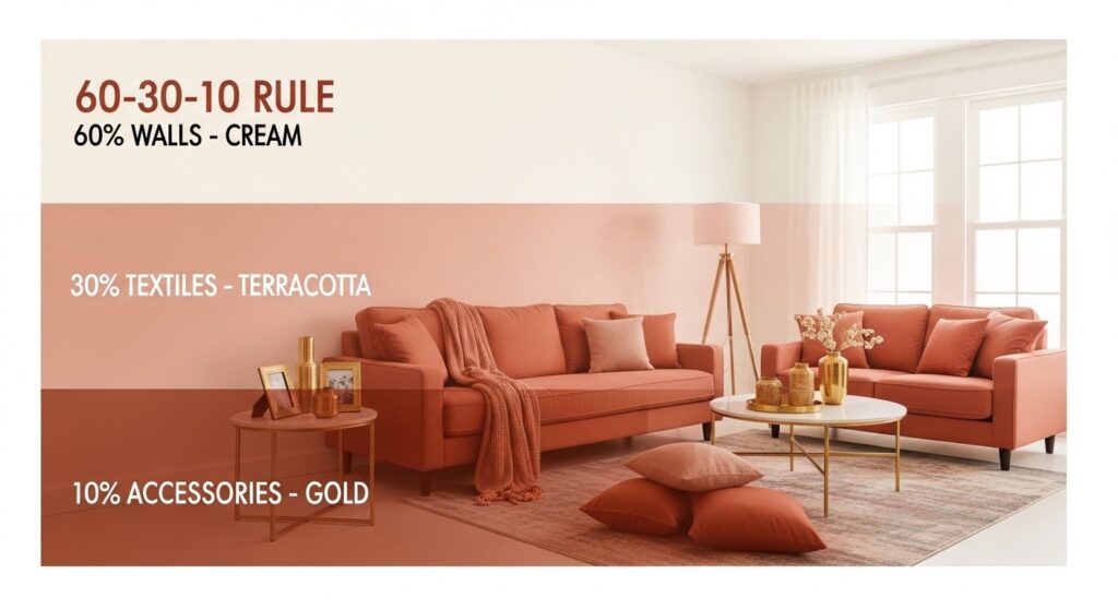
- 60% — dominant: walls, large sofa, main area rug
- 30% — secondary: curtains, accent chairs, ottomans, secondary textiles
- 10% — accent: throw pillows, artwork, candles, plants, cabinet hardware
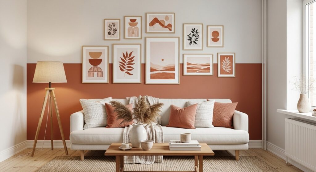
Accent Wall Ideas for Small Rooms
An accent wall is one of the most practical tools in your warm color living room toolkit. When it’s placed well, it adds depth, pulls the eye toward a focal point, and brings in a rich color without committing every wall in the room to that tone. In a small space, the best candidate is usually the wall directly behind your main seating area, or the wall you see first when you walk into the room.
For a terracotta living room feel without going all in, paint just that one wall in a saturated earthy shade and keep the other three walls in a lighter complementary neutral. The contrast creates the impression of greater depth and gives the room a defined center of gravity. You can also try textured finishes — a limewash or Venetian plaster effect on a warm-toned accent wall adds the kind of artisan richness that flat paint simply can’t replicate.
Paint isn’t your only option here. Warm-toned wallpaper, wooden slat panels in a honey stain, and gallery walls built around amber and sienna tones all function as accent walls. These alternatives are especially useful if you’re renting, since they tend to be removable and leave walls intact.
- Limewash paint creates organic texture on a warm accent wall — no specialist skills required
- Wooden slat panels in a warm stain bring richness without any paint involved
- Peel-and-stick warm-toned wallpaper is ideal for renters or commitment-shy decorators
- Anchor your accent wall visually with a sconce, pendant, or floor lamp on either side
Ceiling Color: Match or Contrast?
Most people paint the ceiling white and move on. It’s the default, and it’s rarely wrong. But your ceiling is technically a fifth wall, and it’s making a visual statement whether you intended it to or not. In a warm color living room, what you do up there can either reinforce the cozy atmosphere you’re building or quietly work against it with an awkward cold contrast above everything else.
For a grounded, enveloping feel, try painting the ceiling one or two shades lighter than your wall color, staying within the same warm family. A pale honey ceiling above terracotta walls creates a soft, sunlit quality that makes the room feel like one cohesive, comfortable space. If you’re going for the full color-drenching effect, matching the ceiling to the walls and trim ties everything together beautifully.
If you’d rather keep your walls light and neutral, even the faintest tint of a warm blush or amber on the ceiling introduces color overhead without it becoming a statement. It’s a subtle move — most guests won’t consciously notice it, but they’ll feel the warmth. Our Neutral Living Room Ideas guide covers this overlap between neutral and warm palettes in more detail.
- Match ceiling to walls for full color drenching — creates an intimate, dramatic effect
- Go a touch lighter on the ceiling if you want warmth without the full commitment
- Avoid a stark white ceiling above saturated warm walls — the contrast tends to feel jarring
- Low-sheen ceiling paint diffuses light more softly than flat, which flatters warm tones
Common Mistakes to Avoid
Knowing what trips people up is just as valuable as any decorating advice. Before you reach for a brush or place an order, make sure you’re not falling into one of these very common traps.
- Not measuring first. Ordering a rug or sofa without checking exact measurements first is the fastest way to end up with a room that feels worse than when you started. Measure your space, measure your furniture, then order. Every time, without exception.
- Ignoring what’s already there. Your floors, existing furniture, and fixed fixtures all have color undertones. Choosing a new wall color without testing it against these elements is a recipe for an expensive mismatch. Always sample before you commit to a full tin of paint.
- Chasing trends instead of your own taste. That trending terracotta shade looked incredible on the mood board. But if you’re not someone who naturally gravitates toward earthy, rustic vibes, you’ll feel disconnected from your own room. Decorate for the version of yourself that actually lives there.
- Skipping the planning phase. Starting with one impulsive purchase and building outward from there almost always produces a room that feels disjointed. Sketch a rough plan, decide on your palette, and shop with a clear direction before buying anything.
Frequently Asked Questions
Q1: What’s the most important element to focus on first?
Start with your wall color — it sets the tone for everything that comes after. Walls cover the most surface area in a room, which means they carry the most visual weight. Once you’ve landed on a wall color that genuinely excites you, decisions about rugs, furniture, curtains, and accessories become significantly easier to make. Think of the wall color as the foundation your entire warm tones living room is built on. Get that right, and the rest tends to fall into place.
Q2: How do I start this kind of project without feeling overwhelmed?
The easiest entry point is textiles. A new throw pillow, a rug, or a blanket in a warm tone you love lets you test the palette against your current room with very little commitment and minimal cost. Once you see how those warm tones interact with your existing light and furniture, you’ll have a much clearer sense of whether you want to take it further with paint. When you do feel ready to paint, buy a few sample pots first and apply large swatches — at least 12 by 12 inches — on different walls before purchasing a full gallon.
Q3: What’s a realistic budget for refreshing a living room with warm colors?
You can make a meaningful difference for anywhere between a hundred and two thousand dollars, depending on how far you take it. A simple refresh using new throw pillows, a rug, and a few plants or candles in warm tones can transform how a room feels for well under two hundred dollars. A mid-range update that includes a gallon of paint, a new accent chair, and updated curtains might land somewhere between four and eight hundred. A full living room overhaul — new paint, a large rug, reupholstered or replaced sofa, and layered accessories — can run from one to two thousand dollars or more. The upside is that warm, classic palettes tend to stay relevant for years, so the investment holds longer than trend-driven redesigns.
Q4: How long does a warm color living room makeover typically take?
The planning and sourcing phase takes the longest — expect one to three weeks of browsing, sampling paint colors, and waiting for deliveries. The actual painting, if you’re doing it yourself, usually takes a weekend for a small to medium-sized room. Arranging the finished space — placing furniture, layering textiles, hanging art — typically takes a few hours once everything has arrived. From the first decision to a finished room, plan for two to four weeks in total. And try not to rush the planning phase. That’s where most decorating regrets get made.
Conclusion
Warm color living room ideas aren’t reserved for large homes or experienced designers — they’re for anyone who wants to walk into their living room and actually feel good being there. Whether you start with a single terracotta throw pillow or go all in on color-drenched walls, the principles in this post give you a clear, practical framework to work from. The 60-30-10 rule, strategic accent walls, and thoughtful ceiling choices are the tools that turn an ordinary room into one that genuinely welcomes you home.
You don’t have to figure it all out at once. Start small, test your palette, and build from there. Every layer you add to a warm tones living room makes the next decision easier and the room better. Trust the process, trust your own instincts, and remember that a room full of warmth and personality will always outlast a room that just followed the rules.
Ready to go deeper? If you’re working with a mostly neutral foundation and want to see how warmth fits in without starting over, our next post is the perfect next step.
→ Read Next: Neutral Living Room Ideas That Still Feel Warm